Skills learned in this project


Project Discription

This was a group project assigned to us in a Social Practice Seminar. We each had individual interests and ideas that we had tried to culminate into one project that ended up becoming Full Volume!

When we noticed that we all shared a bond with music in vancouver, the idea for this project developed. One of the groupmates discovered a website called Queering the map, based in Vancouver that shared stories of queer people all throughout Vancouver. We wanted to make an app that created that same sense of community with a broader net for the entierty our city.

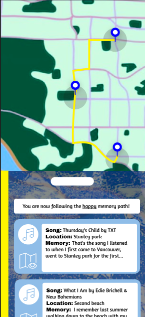
Some of the aspects of our app include a way to upload "memories" with a song of your choice attatched. You can also browse others memories, that they might assosciate with their morning commute or so on. You can choose to go from one persons memory to another or randomly see if there is a song associated to your current location. You can also choose to follow a path that is associated with a mood. For instance, going from one momory to another on a trail with happy upbeat songs at each location. Or the same situation in reverse, going from one location to the next following the "unhappy trail" with a slow/sad song at each landmark.

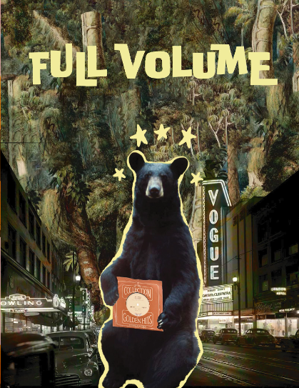
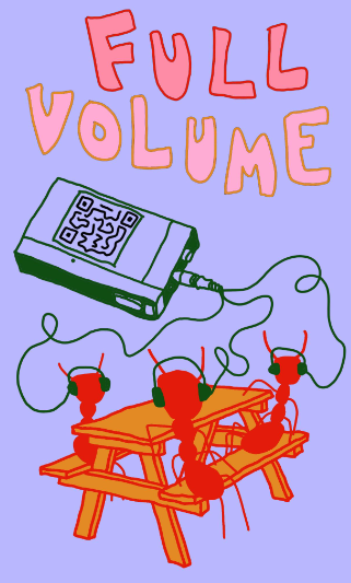
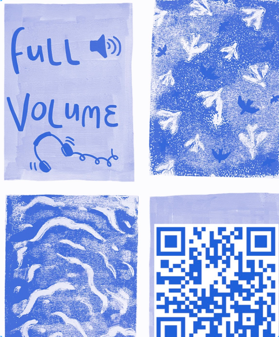
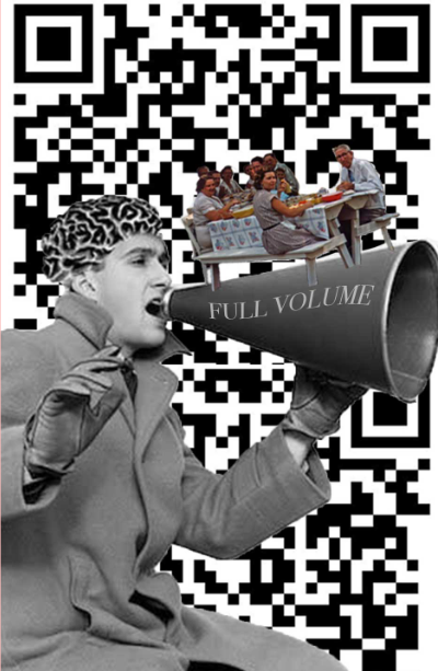
There were posters created and stickers with QR codes and physical benches that would be scattered throughout Vancouver as a physical way to view these memories.


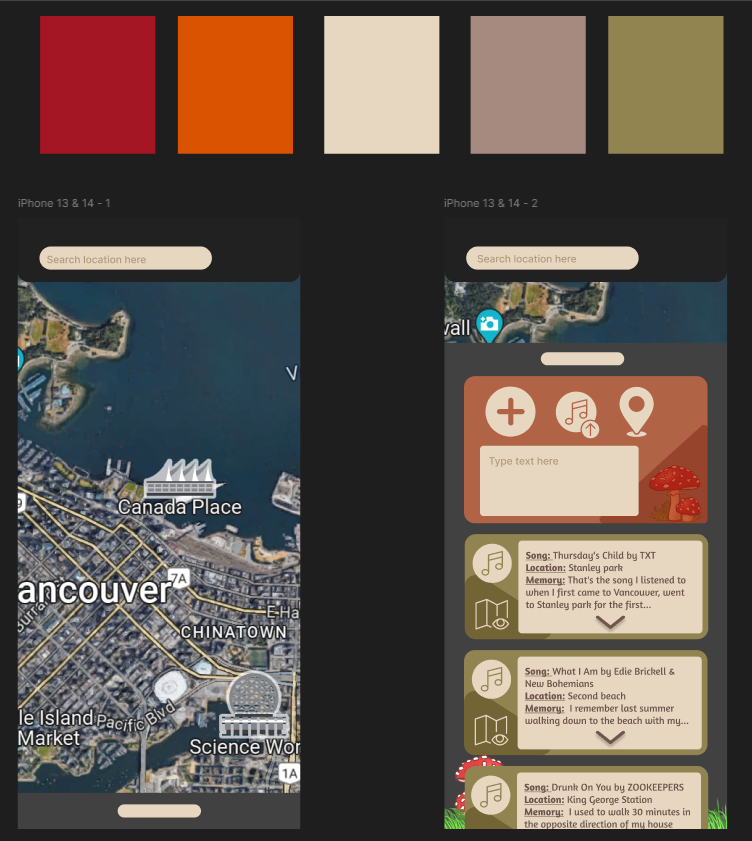
This is my original design and layout for this app.

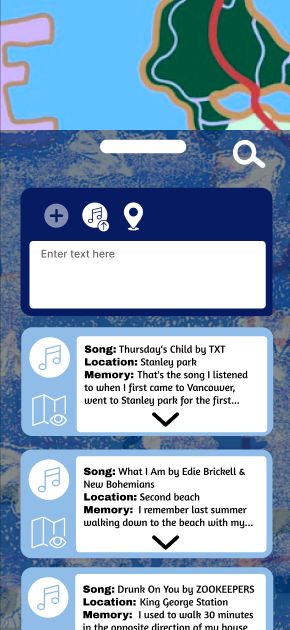
I had wanted to create an app that really connected the user to the location that they were in. I wanted to incorperate some of the canadian warm colours and other earthy tones to get the user to think about the land. I tried to keep it similar to apps that already exist for easability of use as well.

I had designed this layout in about a day on my own before I had recieved any input from my team mates. You can see later on this page how their imputs and even the posters created changed the final prototype for the app layout.

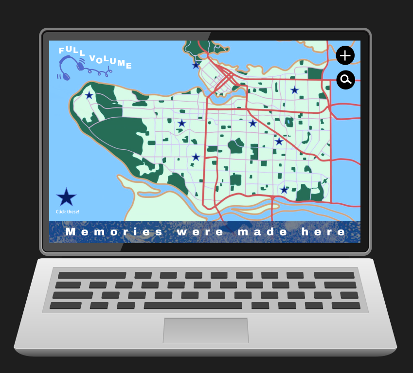
This is a sample of our final prototype for how our website should look like on a laptop

>

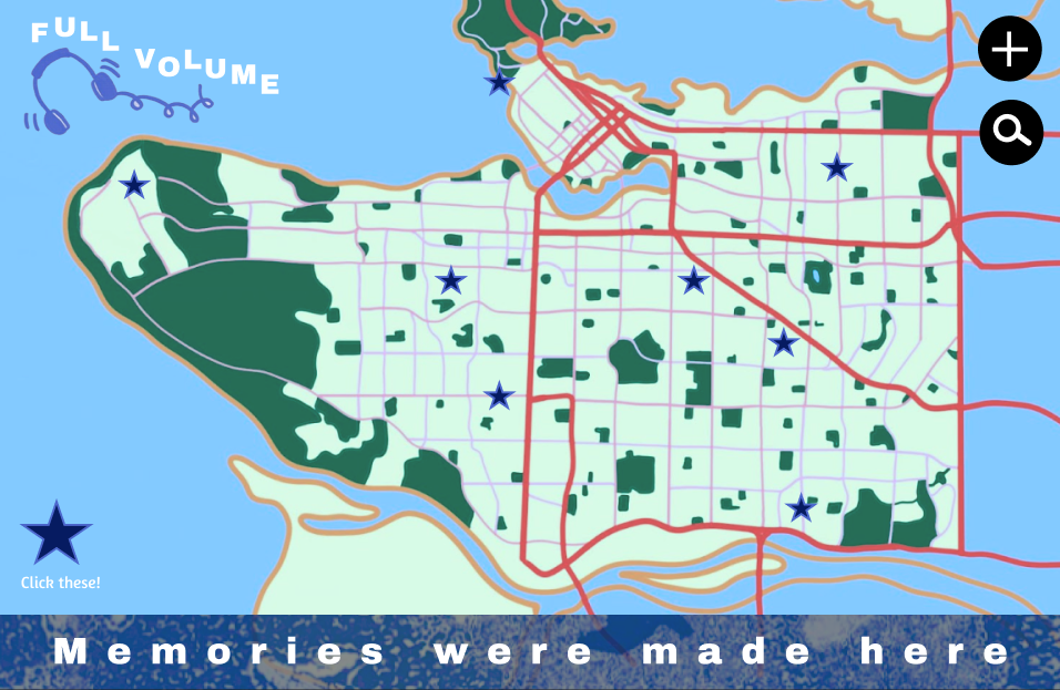
On the left you can see a map of vancouver. The + on the top right was placed there as a way to add memories, and the search bar below that is designed for users who wanted to look up a particular address or song.

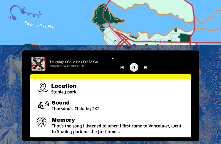
The stars around the map are clickable memories, that once selected, will look more like the screen to the right. The image on the right shows the song associated with this memory and location. Below is the memory that is connected to both the song and area.

Most of these laptop designs were created by a classmate inspired by my phone designs.

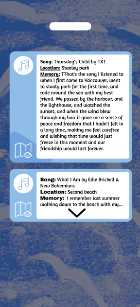
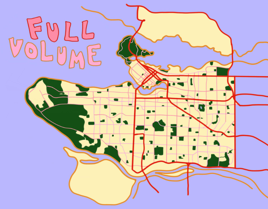
Here you can see the final layout of the app version of the website. Below this you can see some of the photos created by the groupmates and how they were used in this application.